Mobile App Graphics How To Make Icons For The App Stores Tutorial
Mobile app graphics tutorial to learn how to design icons and splash screens for the app stores. Mobile App Graphics are an essential part of any app. Icons and splash screens have much more importance for mobile apps than websites.Much of the user experience (UX) is directly tied to the images they see. Your mobile app icons should convey the app's purpose. This tutorial will show you what you should know about designing graphics for mobile apps. We will take you through the different types of icons and what they are used for.
Why are mobile app graphics so important? Because the limited space on mobile devices means the app MUST convey more information in a smaller space. Icons and images are ideal for this purpose.
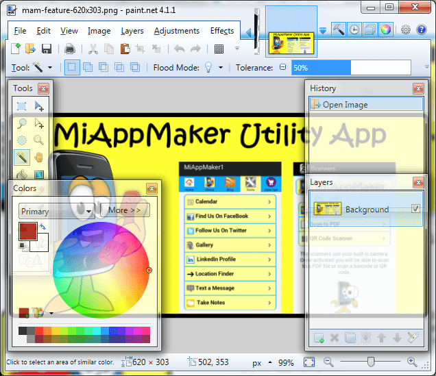
It does not matter which graphic editor you use to make you icons and images so long as you are able to add text over top of your images. In most cases you won't need to do this but you will in some instances want to add text. We use Paint.net because it is freeware and easy to use. Plus there are several free plugins to enhance it's capabilities.
How To Design Mobile App Icons


You MUST have at least 1 App icon and 1 Splash screen. But the more you have the more compatible your app can be with more mobile devices. Here are some "Application Icons."
App Icon (Retina)
App Icon (iOS 7)
App Icon
(72px)
You will need to make graphics for the application Icons. These icons are used on various mobile devices. You need 5 to 8 images for display in the app stores as well. Apple gives you the option to upload up to 8 icons and 7 splash screen sizes. Google Play wants you to upload 1 high resolution application icon, 1 Feature Graphic, 1 promo Graphic, 5 app icons and a splash screen. More on that later.
The above mentioned graphics do not include the icons that go into the app. You will want 4 to 7 icons for labeling the pages in your app. With a small screen space available You want small icons and one word labels for each page. Example: Home, About, Share, Tools, Blog.
App Icon (144px)
App Icon (114px)
App Icon
(72px)
App Icon
57px)
App Icon
(48px)
App Icon
(36px)
Let's get started, first up Google Play. Multimedia icons are application launching icons and should be 32bit .png format with alpha channel for transparency. You need at least one icon. We recommend you make 5 individual icons sized at 36px square, 48px sq., 72 px, 96px and 144px all square. Very similar looking icons are a requirement.
Icons for Apple App Store have different size requirements. They are: 180px by 180px square, 150px, 144px, 120px, 114px, 72px and 57px (all square shaped). We will get into the specifics of making icons later in this tutorial.
How To Design Splash Screens For Mobile Apps
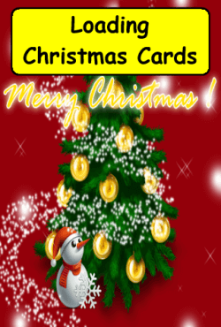
The Splash screen is the first image a user sees so it MUST identify the app. I like to include the name of the app along with the the main icon or theme and some extra information. You can also give some instructions to the user.
The Splash screen image can be 320px wide by 480px in height up to 1080px wide by 1920px high. This gives an aspect ratio of 2/3. The 320x480 screen size is about the smallest out there. So designing for this size means your screen will fit on any larger device.
Typically the Splash screen is zoomed to fit the mobile device screen it is loading on. The larger 1080x1920px size is intended for larger tablets. You can make just one of these for Google Play and it will work on most devices. I recommend making at least the Splash screen 320x480px.
Here are the required Splash screen size for Google Play: 320px wide by 480px high .png format. Thats it!
Here are the Splash screen sizes for Apple App Store: 320x480px, 640x960px, 640x1136px, 750x1334px, 1242x2208px, 768x1024px and 1536x2048px. All must be .png format.
Splash screens only display when an app is loading. Once the app is loaded or re-synced it disappears and your app is displayed.
Mobile App Graphics For App Store Display
Google Play and the Apple App Store both ask for large graphics to display on webpages in the app store itself.The "Feature Graphic" goes the 'Featured App section on the developers webpage. Be aware that you can not include more than 25% text in your graphic. See what I did on this graphic. I included a very large version of the icon and have a large headline with the name of the app.
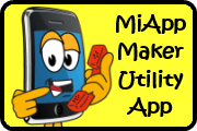
Promo Graphic
180px x 120px
For this graphic I only include the app icon and the name of the app. You could get pretty fancy here but my recommendation is NOT to, keep it simple. You should take the time to make this graphic look great. Make sure all the components fit perfectly and work well together. Try to get your text as large as possible but not overly big.
This hi-res icon must be a higher resolution of your 'App Icon' that is 48px square. It should contain only your app icon logo and app title.
Mobile App Graphics Tips and Recommendations
Something of great importance you should know is that graphics are owned. You must either make your own or own the rights to the graphics you use on your website or mobile app. You should always create your own mobile app graphics if possible. Or you could purchase them from a reputed source and buy the rights to use them.A couple of places you can get mobile app graphics are iStockphoto.com, BigStockphoto.com. Or you can search the Internet as there are several icon sets you can download for free.
Wondering how I made all those graphics? I used paint.net as my graphic design platform. Paint.net is free software anyone can download. PDN is a graphic design editor that is an upscale of MicroSoft Paint. Only on steroids. It can't do everything Adobe Photoshop can but allows you to create mobile app graphics without having to hire a graphic designer or pay a fortune for software.
The icon graphics use three layers. The first layer has the yellow background and black border on it. The second layer contains the cartoon caricature. The third layer has the text on it. I save them in the .png format and flatten the image when I save. Be aware you will sometimes be asked to save the graphic as a 24 bit (no alpha) format. In Paint.net you can easily select this option when you save.
Contact Us To Request Mobile App Graphics Info
See Also:
Mobile App Builder - tutorial teaches you how to begin making your own mobile app.
Mobile App Editor - tutorial teaches you how to use the editor to configure your mobile app.
Mobile App Plans - tutorial teaches you how to select a plan for your mobile app(s).
Hope this helps.
Tim
Home : Mobile App Templates : Mobile App Graphics
61 W. Annabelle Ave. Hazel Park,
MI. 48030-1103, U.S.A.
telephone: (248)546-0374
email: support@best-website-tools.com
© Copyright 2007-2025 All rights Reserved.
Sun: closed
Mon-Fri: 9:00AM to 6:00PM
Sat: 9AM-12:00PM
Closed Holidays
