SBI New Template Website Design Site Build It Color Theme
I wanted to show you 2 things with this article. First the expandability of the current template. Second the future of Site Build It (SBI) website design. At present there is a contest going on for all SBIers (now till Oct. 31st). This is a design contest to determine the ten best SBI new templates, 1 for each category:
|
|
This template uses a blue and yellow color theme but any 2 colors could be used. I just happened to have several pictures with my team's colors showing. So that became the theme for the website design. Okay, ya got me, really I'm trying to show off my favorite team.
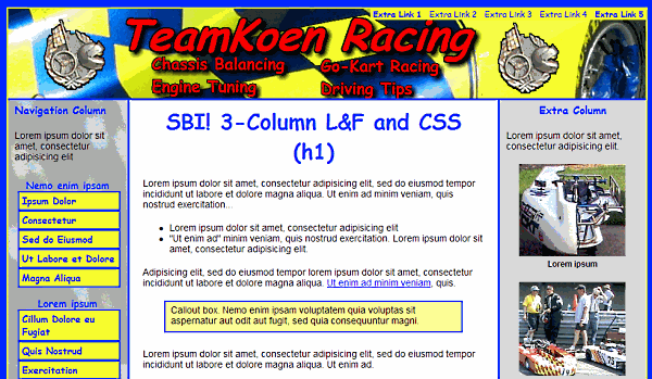
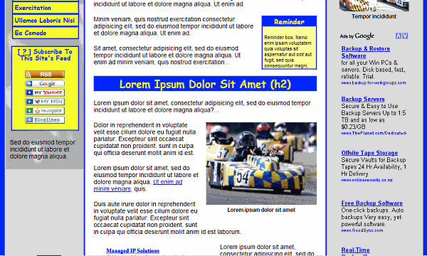
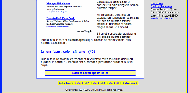
 For the contest you need to explain why you developed your website design the way you did. My intention is to show how to create a team oriented website design based on team colors. Note, the team could be any team it doesn't have to be sports. It could easily be a corporate, marketing or any type of team.
The concept is simple, use your team's colors to create the SBI new css template, then populate the content with images that contain those colors. Other design criteria include font, style and layout.
For this SBI new template I used 2 fonts 'Arial' for the content and 'Comic Sans ms' for titles. I used Arial because it is an easy to read no frills font. This font helps establish professionalism in the content. And I used 'Comic Sans' for the titles to lighten the website design up some. I wanted a kind of happy go lucky feel. Another reason for the 'comic sans' is to appeal to a younger audience.
 For styling, I adjusted the general size of the page conponents to emulate most current Site Build It websites. Note that these sizes are changeable, they can be anything you like. The widths and heights are not set in stone. By changing the column widths you can increase the content area up to 660px.
This SBI new template incorporates a neutral color theme for the background (white and gray). But you could easily use any color theme you like. I used white in the center column to get maximum contrast for the text. After all, what I really want is for visitors to read the content. I used a gray in the outside columns background to further enhance the center column as the most important one.That brings us to the layout.
 This layout is 3 column with navigation on the left, content in the middle and the right column is for advertisements or whatever you like. Overall width is set at 960px with 10px of free space allowed on each side of the columns.
The left (navigation) column is set at 180px with 160px being the usable content width. The middle (content) column is set at 560px with 520px of usable width. The right column is set at 220px with 200px for usable content width. This width is real popular for right side columns on many popular website designs. Hint: Many marketers design their advertisements for a 200px wide column. So the extra width is helpfull accomodate ads up to 200px wide.
That about sums it up, except for one thing. Notice how the images on this page push the content envelope out to fit, compared to other pages on this blog. The SBI new template doesn't do that real well and requires some fanagling to shoehorn in extra wide images. So if you need to display extra wide pictures be prepared to fanagle your page some.
When these SBI new templates from Site Build It become available we will have the Easy Blogs version here for you. Until then follow along with the contest... iDesign3 contest in the SBI forums.
Home : SBI Home : SBI Templates : sbi new template, website design, site build it, color, theme
61 W. Annabelle Ave. Hazel Park,
MI. 48030-1103, U.S.A.
telephone: (248)546-0374
email: support@best-website-tools.com
© Copyright 2007-2025 All rights Reserved.
Sun: closed
Mon-Fri: 9:00AM to 6:00PM
Sat: 9AM-12:00PM
Closed Holidays
